Why motion charts?
Motion chart allows efficient and interactive exploration and visualization of multi-dimensional data and can make it easier to notice an important trend. Google has done a great job explaining how motion chart can be useful in web analytics and providing a tool for building motion charts based on analytics reports.
Why not using motion charts provided by Google Analytics?
There are a few reasons why a visualization built with charte.ca may be a better choice than Google motion chart:
- it does not require Adobe Flash
- it can be easily shared, privately or publicly
- it provides drilldown capabilities
- it is highly customizable
Creating the visualization
Below are the steps I followed to create the chart above.
Preparing the data
In my Google Analytics console, I created a report that shows the following metrics for each acquisition channel:
- number of sessions
- bounce rate
- goal completion rate
- goal completions
Metric numbers are grouped by month for the period of two years: 2016 and 2017 (see "Secondary dimension: Month of Year" dropdown in the top left corner of the report. Google shows months in a "YYYYMM" format, which may not be the most readable option, but works well for reporting purposes.

I exported the report as Excel file using Export -> Excel menu command:

For the sake of this example, I replaced the real data with fictional numbers and submitted the spreadsheet to Google Docs and made it publicly available, see the "Snapshot" tab. This will be the data for the top-level motion chart with the following metrics:
- Bounce rate (x-axis)
- Goal 1 Conversion Rate (y-axis)
- Sessions (z-axis, bubble size)
- Month of year (category)
- Channel (bubble color shows the type of channel)
For channel-specific sub-charts (drilldowns), I decided to work with the following metrics:
- Sessions
- Goal 1 Completions
- Bounce Rate
- Goal 1 Conversion Rate
so I created separate tabs for all four channels and populated them with those four metrics. See tabs named "Direct", "Organic Search", "Referral", "Social".
Creating the top-level chart (motion chart)
I opened the charte.ca editor and created a new motion chart (let's call it "blog-web-analytics-summary"):

In the "Data" panel, I clicked the "Import" button and copy-and-pasted "Snaphot" data to the text area:

On step 2 of the import wizard, I mapped data columns to motion chart dimensions as follows:

I completed the wizard using default settings and ended up with a motion chart displaying four bubbles: one bubble per channel. I tweaked chart appearance (size, colors, fonts, title/subtitle), switched to log scale for x-axis, turned off automatic animation start, and added trend lines (see "XY regression options" panel) for the bubbles. Not surprisingly, since my numbers are fake, there is a good correlation between bounce rate and goal conversion rate. Please do not be puzzled by the shape of the linear trends - this is what they look like when one of the axis is logarithmic.
Creating sub-charts
I navigated back to "My charts" and created a new dual-axis chart "blog-web-analytics-direct":

After copying "Direct" data from the Google spreadsheet right into the chart data spreadsheet

I set chart size to 800x600 (it must be the same as the top-level chart's) and played a bit with chart appearance, title, axis labels and made sure that absolute numbers (sessions, goal completions) are bars and percent values (bounce rate, conversion rate) are lines:

I repeated these steps for other channels: Organic Search, Referral, Social. This is where "Clone" command comes handy.
Configuring drilldowns
I opened the top-level chart again and clicked on the drilldown selector for "Direct" series:

In the selection popup, I clicked "Search" and picked the "blog-web-analytics-direct" chart:
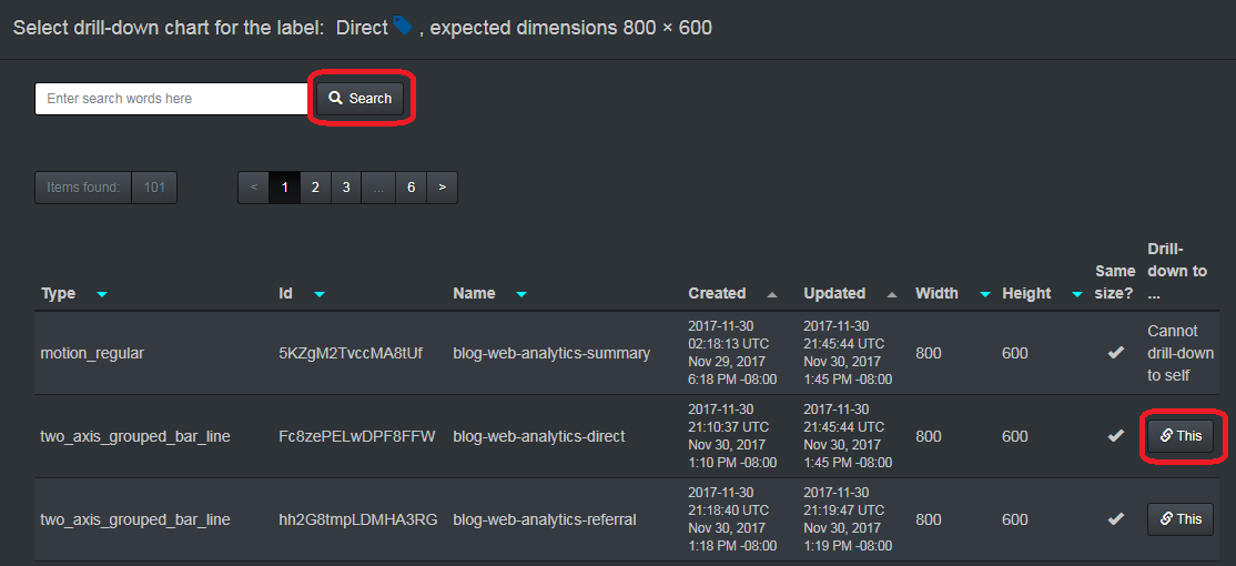
I selected correspondent charts for other three drilldowns and saved the top-level chart. I tested the drilldowns right from the editor by clicking and holding a bubble.
Sharing it
The visualization was ready. I published the top-level chart and embedded it into this post:
<embed src="https://charteca.blob.core.windows.net/pubs/5KZgM2TvccMA8tUf" style="height: 600px; width: 800px;" type="image/svg+xml"></embed>
Alternatively, I could export it as an SVG file

and send it by email or make it visible on the internal website using the same embedding technique:
<embed src="some/intranet/location/5KZgM2TvccMA8tUf.svg" style="height: 600px; width: 800px;" type="image/svg+xml"></embed>
What's next?
This article focuses on sessions, bounce and conversion rate, but there are other metrics available. Working with multi-dimensional data takes some time to get used to, so please experiment.
This comment has been removed by a blog administrator.
ReplyDelete